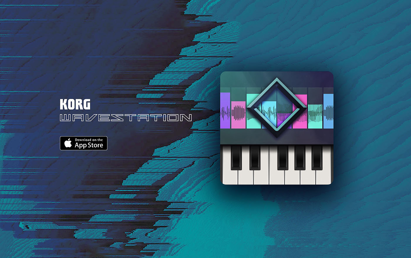
The Korg Wavestate is a wave sequencing synthesizer that can run up to four independent layers of sound simultaneously, each with its own timelines for sample, pitch, shape, gate, and step sequencing. The result is a kind of musical tensor: a multi-dimensional space of sound that evolves differently every time you play it.
The hardware is inspiring to perform on but difficult to program. Bringing it to PC as a plugin offered the chance to give composers and sound designers the screen real estate they had always wished for.
How might we translate a deeply physical, hardware-native instrument into a software experience that is both more powerful and more intuitive?Client
Korg R&D
Category
Audio Product
Contributions
- UX Research
- UI Design
- Creative Direction
Project Link
The Instrument
The Wavestate is a wave sequencing synthesizer from Korg, a spiritual successor to the legendary Wavestation from the early 1990s. Rather than playing a static sound, it steps through independent sequences of samples, pitches, amplitudes, and shapes that can all run at different lengths and in different orders. With four independent layers, each a full wave sequencer in its own right, the patch space is effectively a musical tensor — an N-dimensional parameter space that rarely repeats the same sound twice.
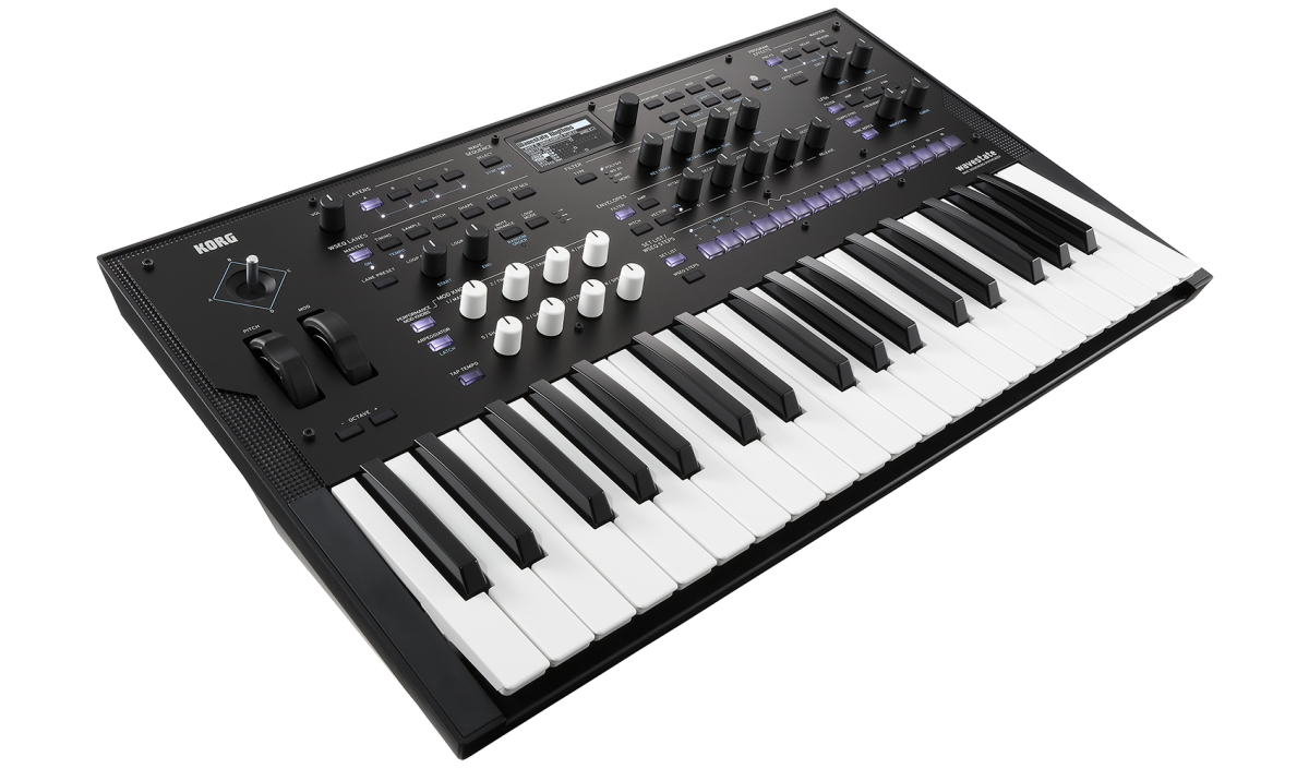
This is what makes the Wavestate so expressive. It is also what makes it so hard to edit on the hardware's small onboard display.
Sweetwater reviewers captured the tension well. Users loved the instrument's direction and felt genuine nostalgia for its predecessor. But the recurring note was the same: the display feels smaller the more you use it. Bringing the Wavestate to PC offered the chance to give composers and sound designers the screen real estate they had always wished for, and to expose the full depth of its signal architecture in a way the hardware simply cannot.
Two goals emerged from the research: make sound design genuinely better, and keep the live performance experience excellent.
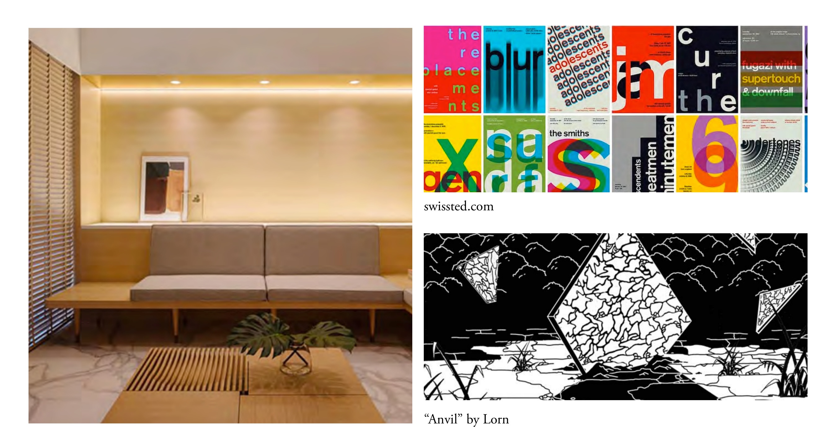
Art Direction & Design Philosophy
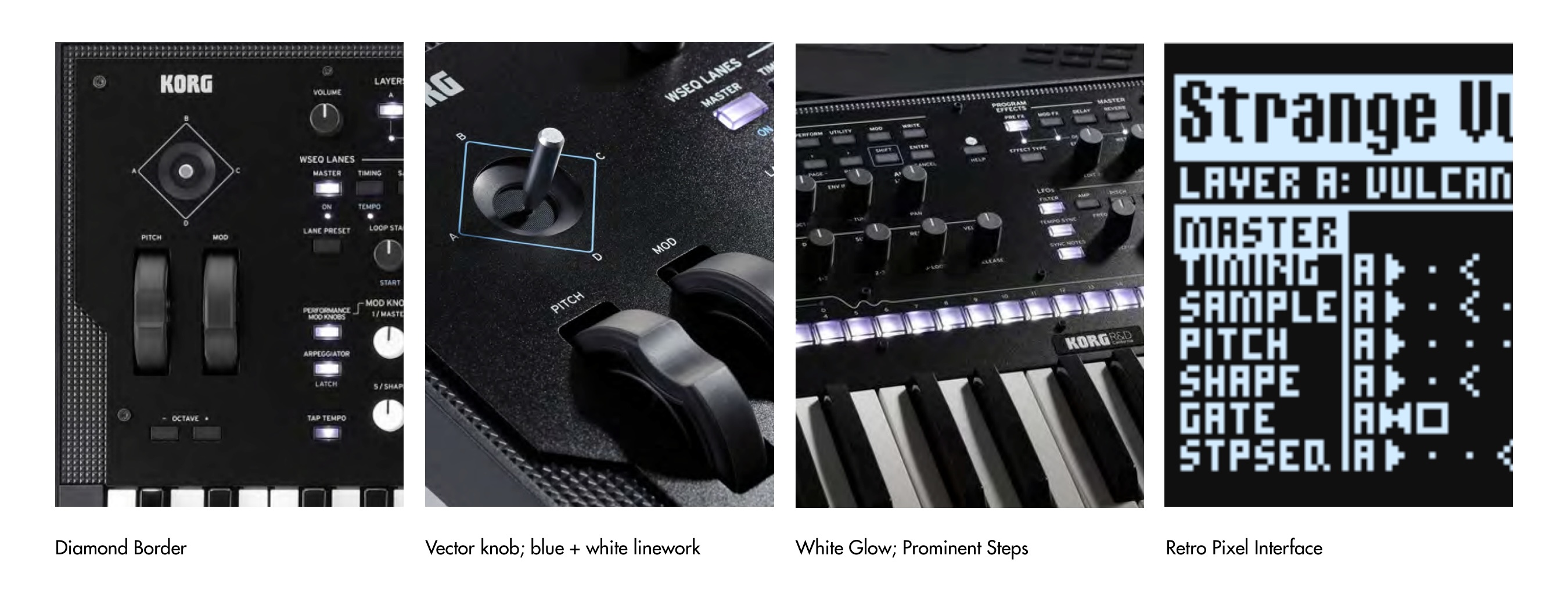
The Wavestate hardware has a distinct visual identity — a futuristic instrument that feels warmly familiar. Key motifs informed the visual language of the software: the diamond border, the blue and white linework around the vector joystick, the glowing white step keys, and the retro pixel display that communicates state at a glance.
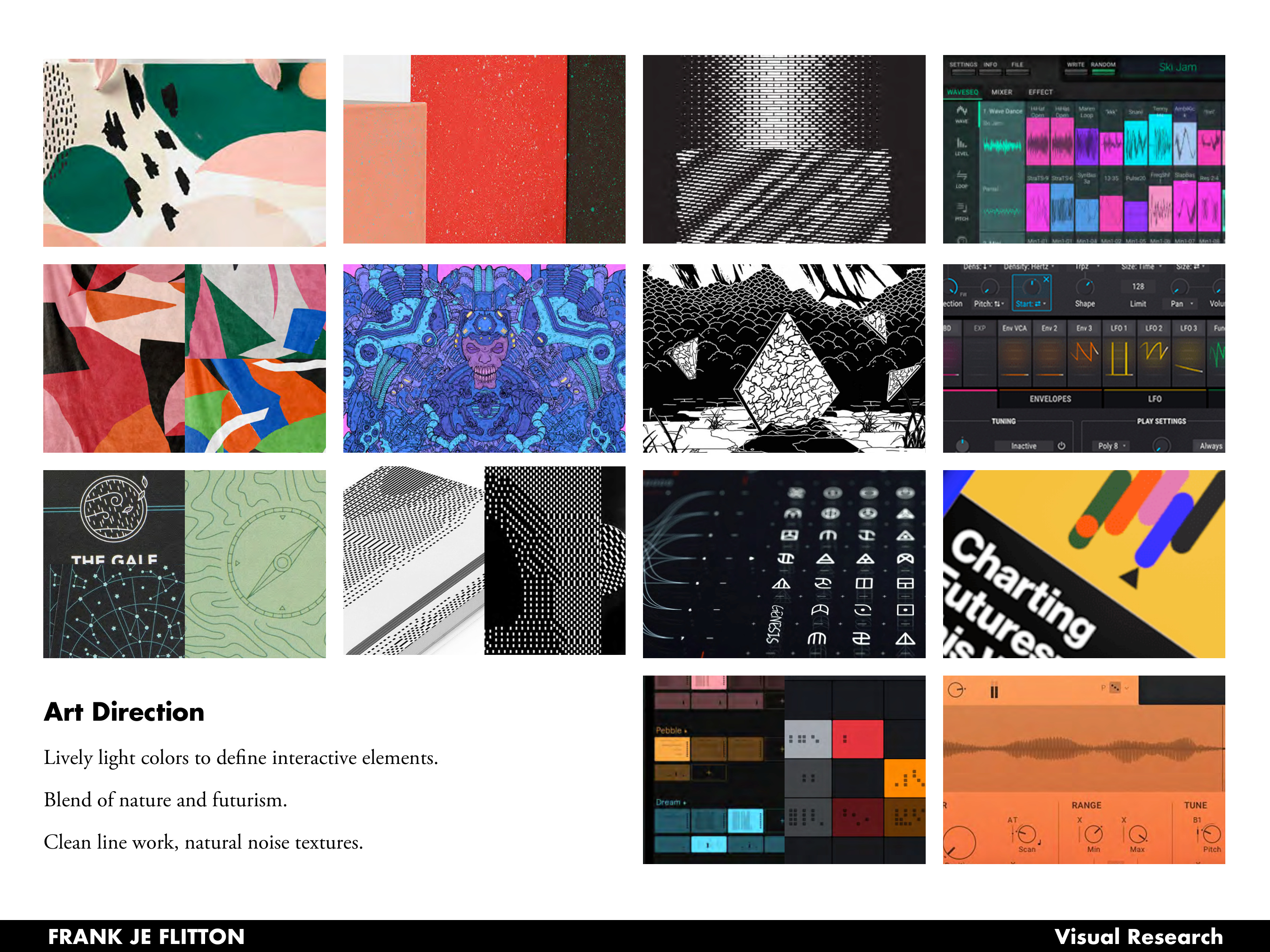
The design philosophy drew from two complementary traditions: Japandi aesthetics (the blend of Japanese and Scandinavian minimalism, where nature, function, and style coexist quietly) and the Swiss Typographic Style (a humanistic mathematical grid that makes complex information feel navigable). Together these set the tone for an interface that is sophisticated and minimal, with geometric clarity and bright color used specifically to call out interactive elements and active states.
UX Research: Mapping the Decision Space
Before any pixels were placed, the goal was to map how users actually move through the instrument. The Wavestate supports two fundamentally different modes of use: performance (selecting a known patch, tweaking it live, and playing) and sound design (building a patch from scratch, coordinating timelines, dialing in effects and modulation).
These modes have very different flows and very different information needs. A performer needs the layer overview and library front and center. A sound designer needs deep timeline access without losing track of which layer is playing which sound.
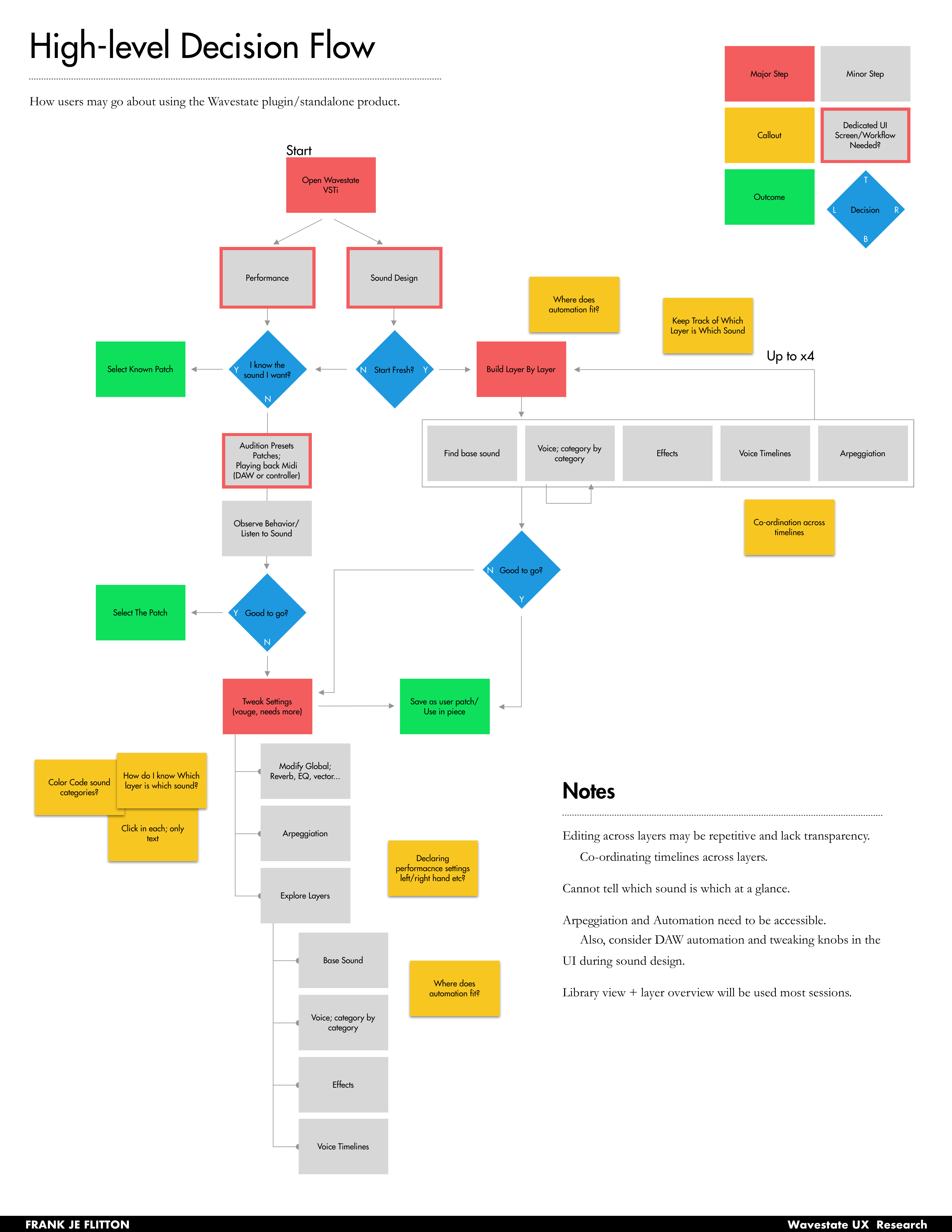
Key pain points identified: editing across layers was repetitive and lacked transparency; users couldn't tell which sound belonged to which layer at a glance; arpeggiation and automation needed to be accessible without leaving the main view; and the library and layer overview would be used in almost every session.
A Config-Driven Design System
One of the core engineering and design challenges was the sheer volume of parameters. Each lane in a wave sequence — Timing, Sample, Pitch, Shape, Gate, Step Seq — has its own set of configurable values, and those values vary depending on the lane type and what mode a step cell is in. Designing a UI that works across all combinations without going bespoke for each one required building around a config-driven component model.
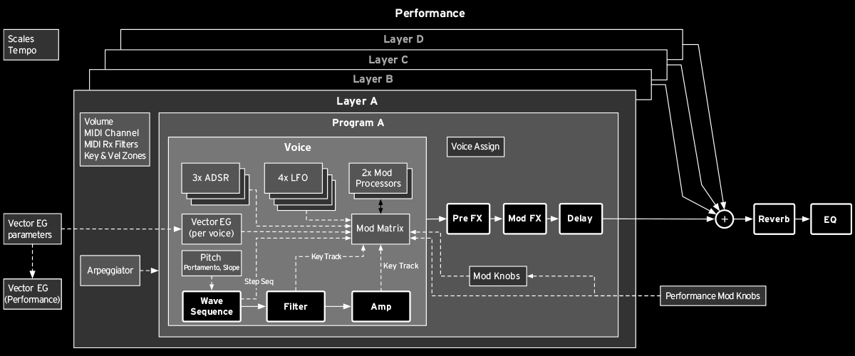
The signal path (oscillators, filters, effects, vector envelope, modulation matrix) informed how parameters were grouped and which ones needed to share visual space. The Inspector panel became the key mechanism: a persistent right-side panel that renders whatever controls are relevant to the currently selected element, driven entirely by the selection state. This meant the center of the screen could stay clean and scannable, while the Inspector adapted dynamically to expose the right parameter set without a custom screen for every case.
This pattern extended throughout the design: step cells, effect slots, generator tiles, and voice-assign controls all follow the same select-and-inspect interaction model, making the interface learnable even when the underlying parameter space is vast.
Layout Exploration
The four-layer architecture presented a fundamental layout challenge: how do you show all four layers at once without overwhelming the user, while still giving each layer access to six independent timelines?
Several layout paradigms were explored and stress-tested against both user modes.
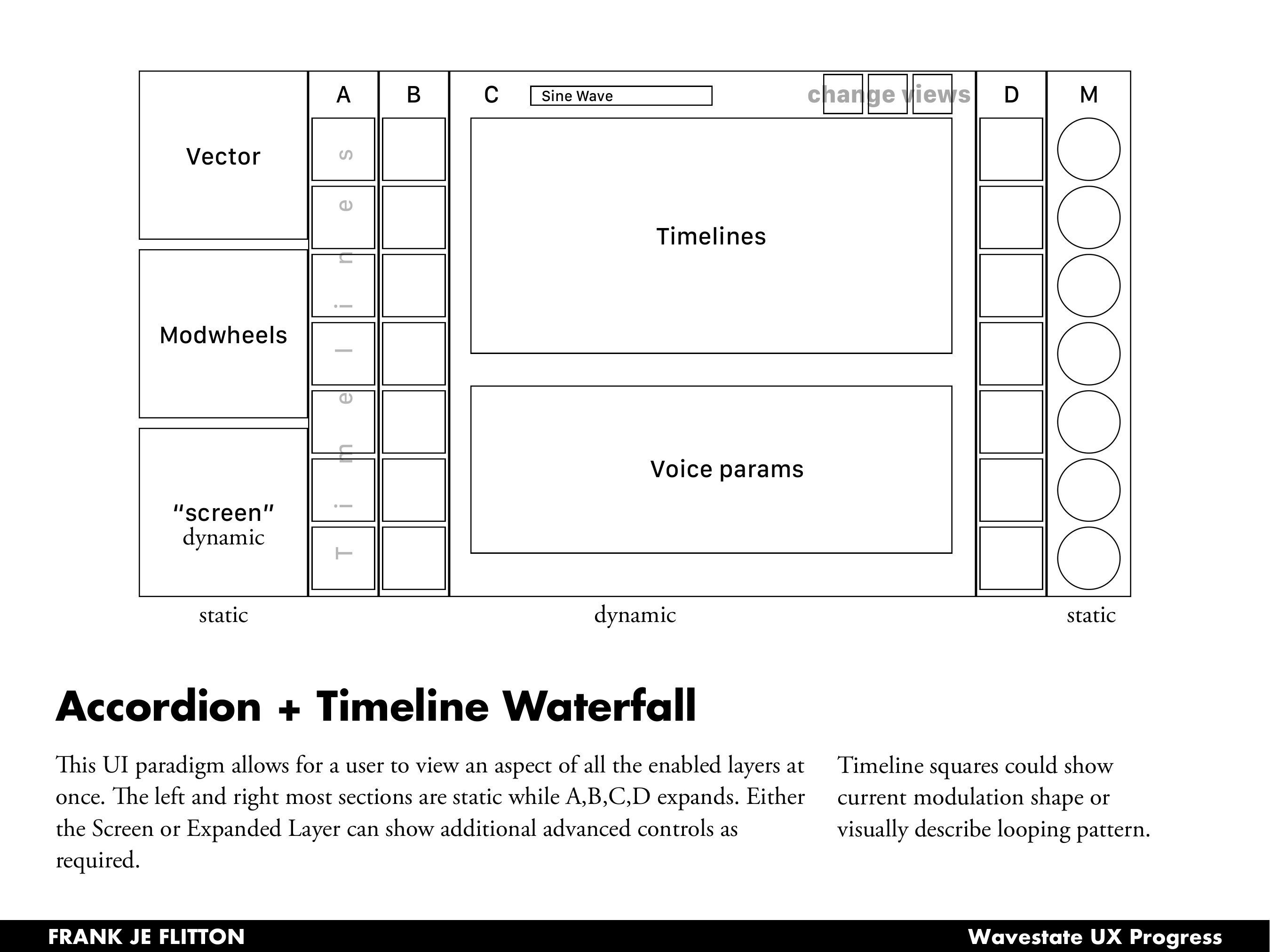
The Accordion + Timeline Waterfall concept treated the left and right columns as static anchors (vector, modwheels, screen controls, mod knobs) while the center expanded dynamically for each active layer. Timeline cells could display the current modulation shape or visually describe the looping pattern at a glance.
The Timeline Wall filled the entire center with all timelines playing back simultaneously — a more visual, performance-oriented approach.
The Not iWavestation concept drew from the iWavestation app's visual language, using a familiar row-per-layer structure with in-line timeline cells and an overlay panel for deeper per-timeline editing.
The Belt layout used a top-bottom split: global settings and layer controls across the top, timelines in a scrollable middle band, and a voice parameter detail tray pinned to the bottom.
The final design drew most heavily from the Accordion paradigm, adapting it into a tabbed layer view that keeps all four layers visible while letting any one expand into its full parameter set.
High Fidelity Designs
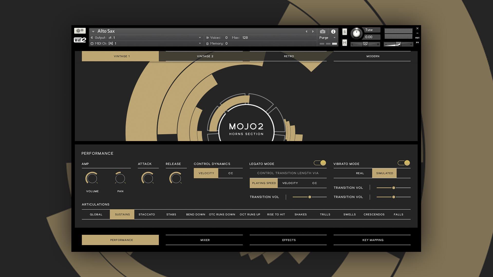
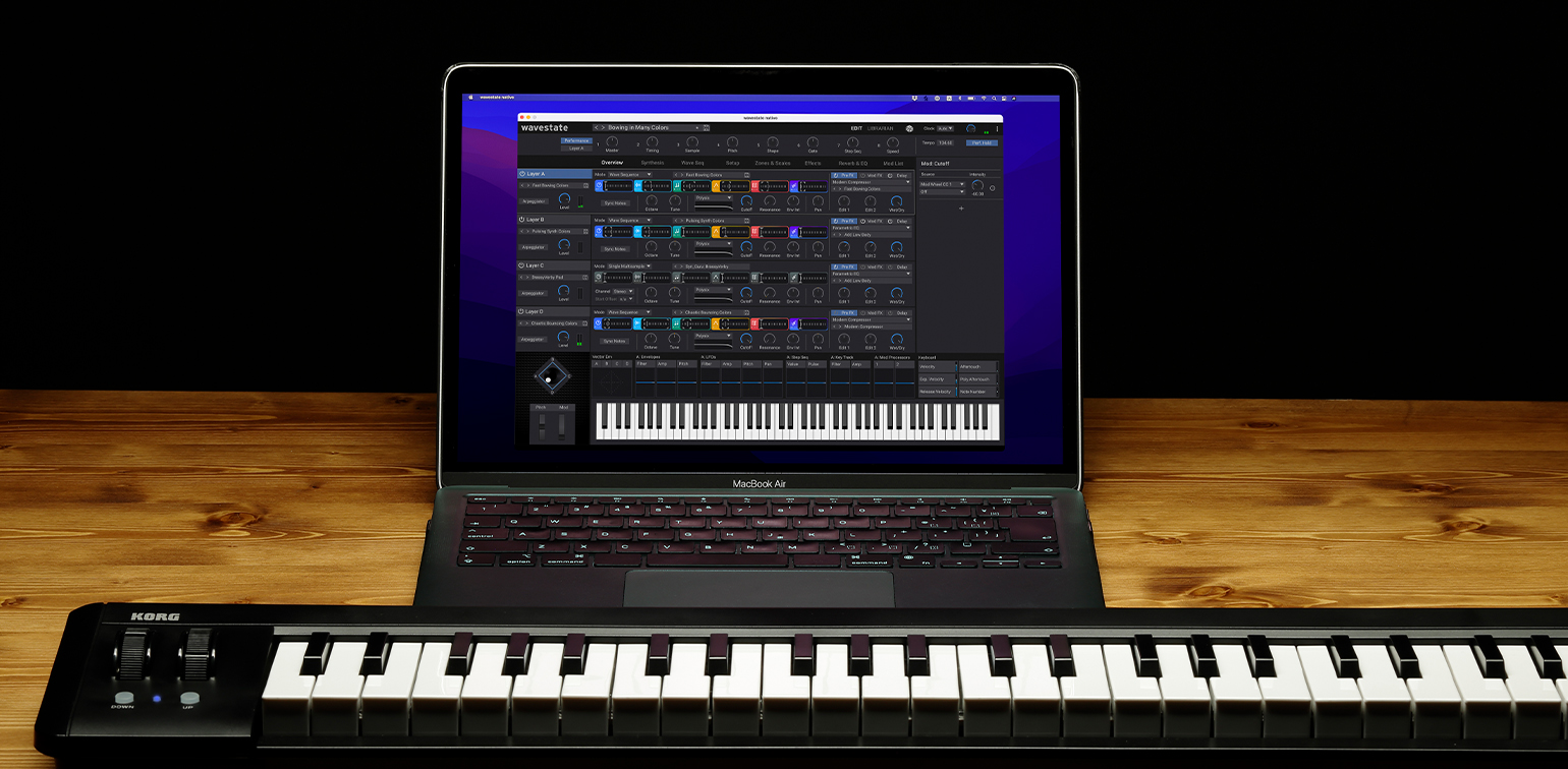
Performance Overview
The performance overview brings all four layers into a single scannable view. Each layer row shows its BPM, active program, the condensed WSEQ lane, filter state, and effects chain at a glance. Active layers are highlighted in blue; inactive ones recede. The Inspector panel on the right provides contextual deep-editing for whatever parameter or generator is selected — no separate screen needed.
This solved the core hardware complaint: you no longer need to navigate a menu tree to see what all four layers are doing simultaneously.
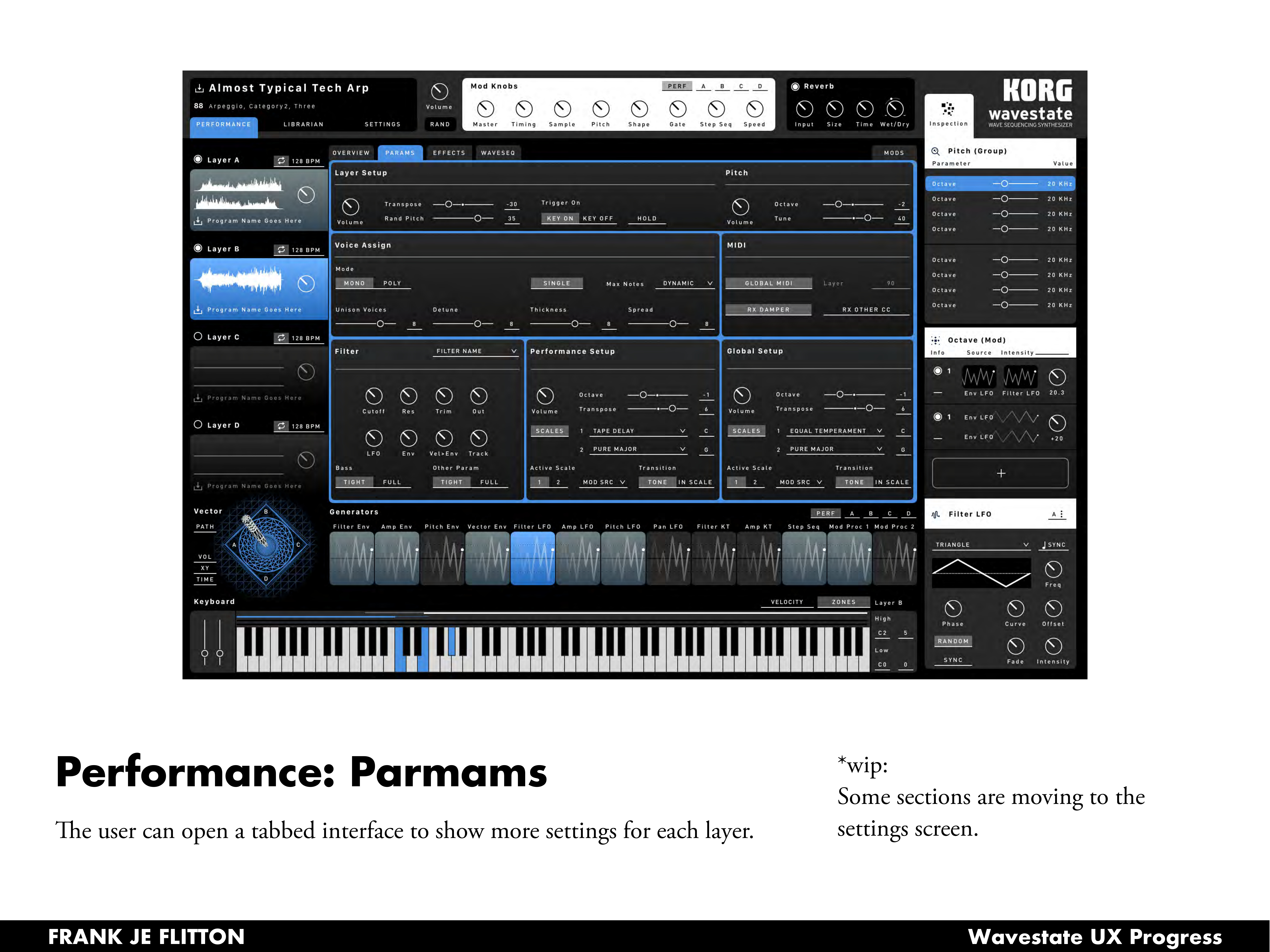
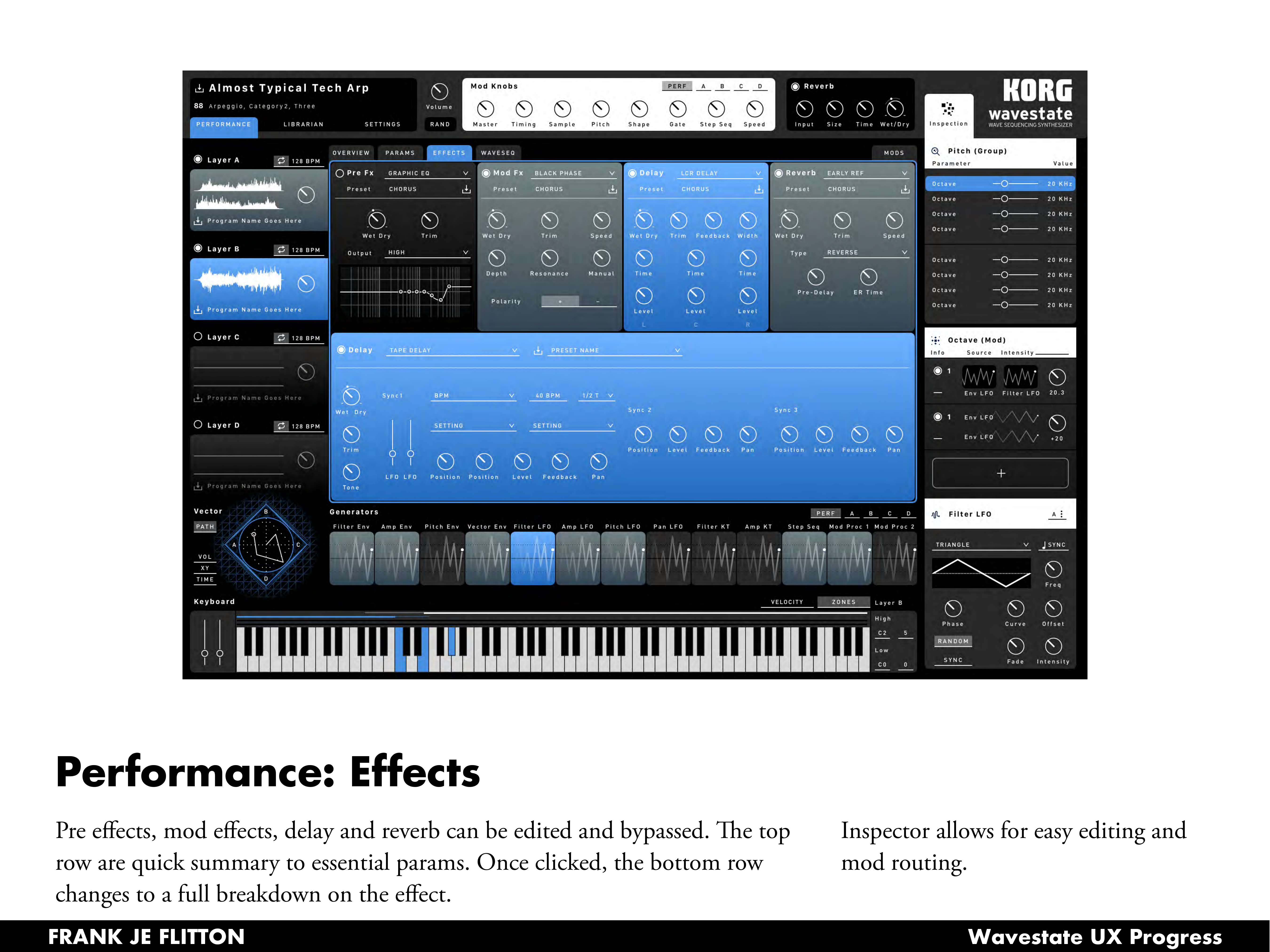
Params & Effects
Clicking into any layer opens tabbed access to Params, Effects, and Waveseq, keeping the four-layer overview persistent on the left while giving the center region over to deep editing.
The Params tab surfaces layer setup, voice assign, filter, performance setup, MIDI, and global settings in a structured grid — all the settings that on the hardware require multiple menu dives, surfaced together for the first time.
The Effects tab exposes all four effect slots (Pre FX, Mod FX, Delay, Reverb) with a quick-summary row across the top. Clicking any effect expands the bottom region into a full parameter breakdown, with the Inspector handling modulation routing on the right.
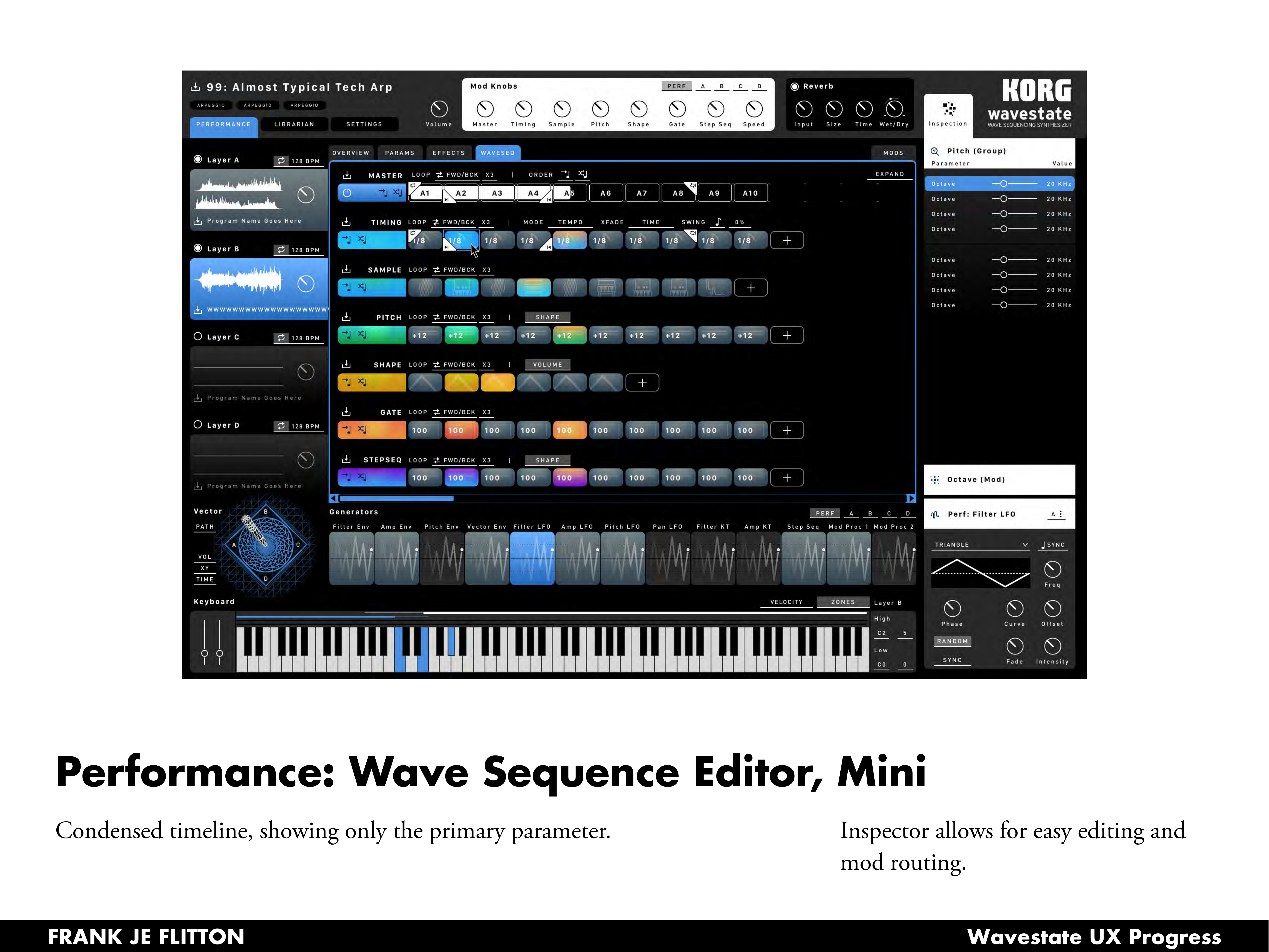
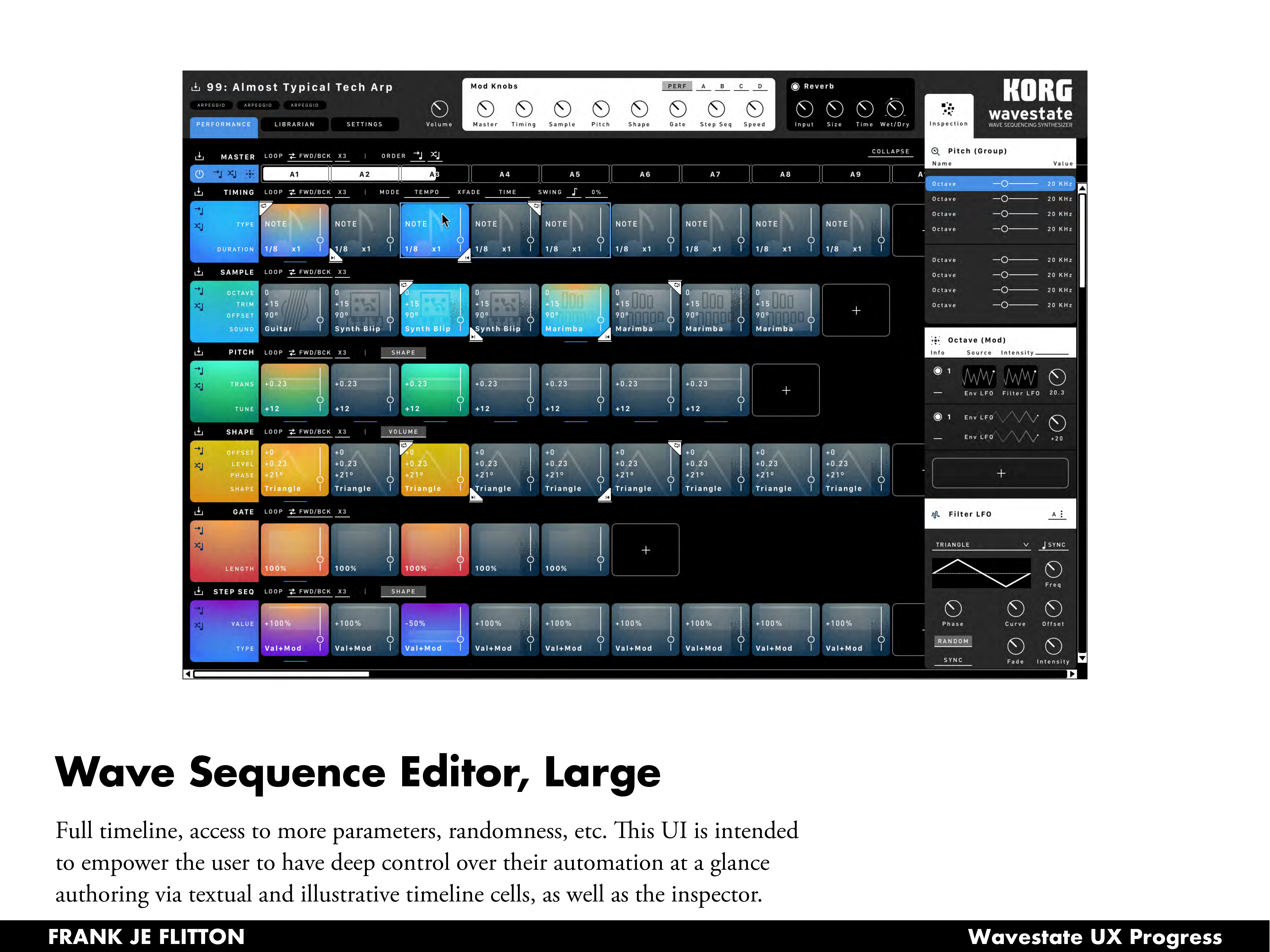
Wave Sequence Editor
The Waveseq tab is where the instrument's real depth lives. Two views were designed for different working contexts.
The mini editor shows a condensed timeline with one row per lane, each step cell displaying only its primary value. This is the everyday editing view: fast to scan, easy to reorder steps, with the Inspector always available for precision work.
The large editor expands to reveal the full parameter set per step cell — octave, trim, offset, and sound name for Sample steps; trans and tune for Pitch; offset, level, phase, and shape for Shape. Color coding ties step cells to their lane type, making the visual rhythm of the sequence readable at a glance.
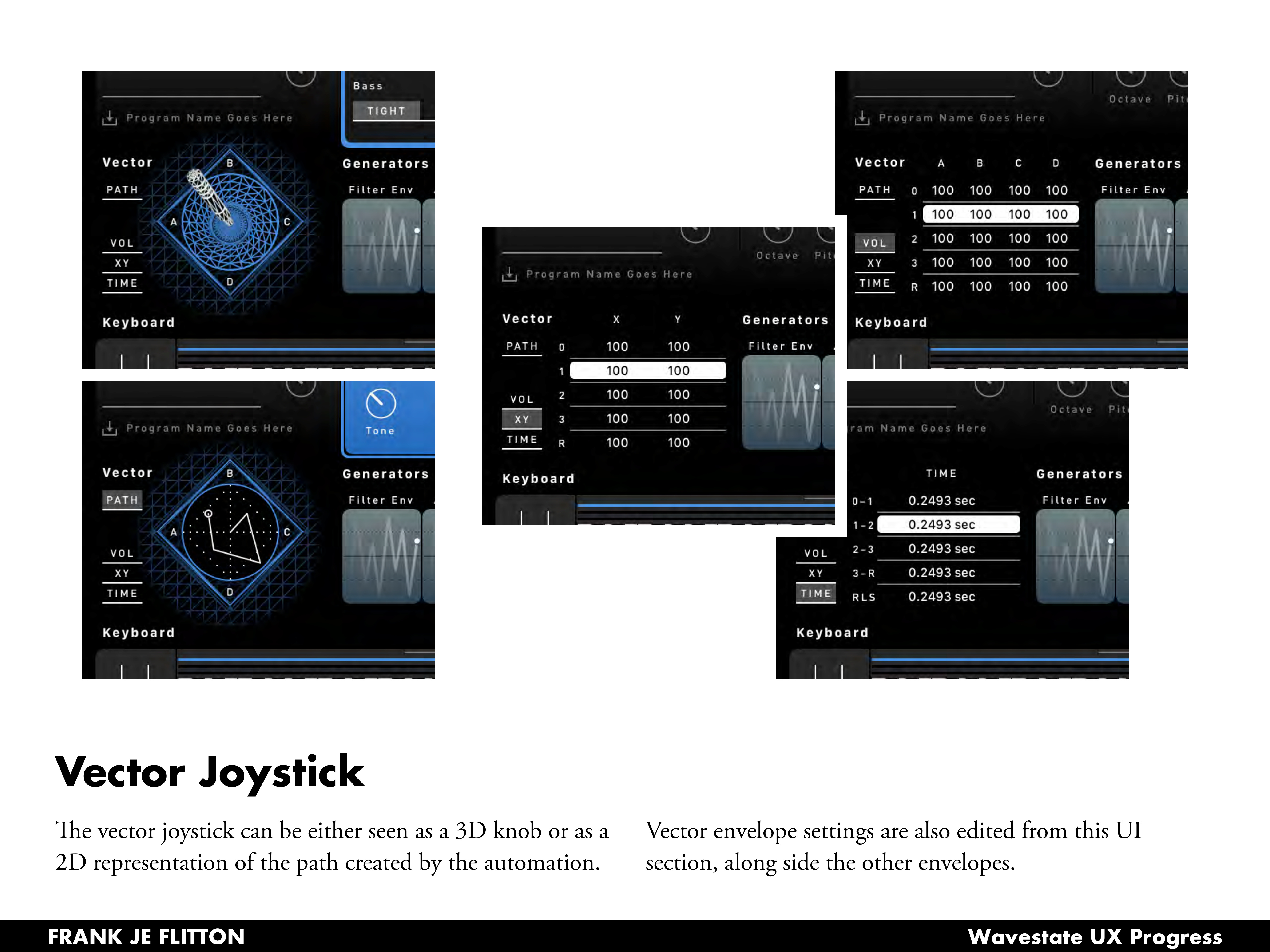
Vector Joystick
The vector joystick section offered an opportunity to make a purely hardware concept visual in a new way. It can be rendered as a 3D perspective knob showing the joystick's physical position, or as a 2D top-down path view showing the automation trajectory it will trace over time. Vector envelope settings sit alongside the other generators, making the relationship between the joystick path and the sound evolution explicit.
Outcome
The designs were delivered to Korg R&D covering the full performance and sound design workflow: performance overview, params, effects, wave sequence editing at two levels of detail, vector joystick, and patch management. The work spanned visual research, UX flow mapping, multiple layout explorations, and high fidelity mockups with component specifications for the development team — designed around a config-driven system that scales to the Wavestate's full parameter depth without requiring a bespoke screen for every combination.