Waves Audio makes some of the most widely used audio plugins in the world. Their quality is unquestionable. Their visual design is not.
This thesis project set out to unify the Waves plugin suite under a single coherent design language — one grounded in accessibility standards, audio industry conventions, and a design philosophy rooted in the mathematics of sound itself.
Client
Thesis Project
Category
Audio Product
Contributions
- UX Research
- UI Design
- Design Systems
- Accessibility
The Problem
Pro audio plugins are both tools and interfaces, and the quality of the visual design has real consequences. A well-designed plugin reduces cognitive load during a session, improves legibility under low-light studio conditions, and communicates parameter relationships at a glance. A poorly designed one forces the engineer to fight the interface instead of the mix.
Waves Audio makes plugins that are technically excellent and commercially dominant. But their visual language across the suite was scattered, ranging from photorealistic skeuomorphism to flat gradient interfaces with no connecting thread. There was no shared grid, no consistent iconography, no unified component vocabulary. Each plugin felt like it had been designed in isolation.
I came to this project as a former Waves user. I knew the tools well, had real frustrations with the interfaces, and could bring that firsthand perspective into the research. The thesis question: could a unified visual system add measurable value to a tool suite that users already trusted technically? And could it do so while also meeting modern accessibility standards that the existing designs largely ignored?
Research
The research phase included a direct consultation with Kate Wilhelm, a UX researcher and author, at the Fluxible UX conference in Waterloo. The session helped sharpen the accessibility framing and informed decisions about contrast, touch targets, and the importance of building constraints into the design before the layouts began.
A likes and dislikes audit across the Waves suite produced three pillars the project would stand on: Branding (a coherent visual identity), UX (interface patterns grounded in how engineers actually work), and Design (an accessible, modern component language). An accessibility audit of the existing plugins confirmed that every single one failed WCAG AA contrast standards. This wasn't a minor polish issue — it was a systemic failure across the entire product line.
Design Philosophy: Why Circles
The formal language of the redesign centers on circular forms, and the reasoning runs deeper than aesthetics.
Music is fundamentally cyclical. Tones and scales are commonly described as linear sequences (A–B–C–D–E–F–G) but they are perceptually and mathematically circular: the note A at 440Hz is the same note as 220Hz or 880Hz, just an octave away. The interval repeats. The pattern is non-terminating. A circle is the more honest representation.
Circular knobs are also a more efficient UI mechanism than sliders in high-density contexts. In the same horizontal space that a single slider occupies, three knobs can be placed with padding — a 3:1 spatial advantage when working with the dense parameter sets typical of compressors, EQs, and reverbs. And the perceived gradual, non-linear nature of audio — the way compression ratios and reverb times ease in and out perceptually — maps naturally onto a rotary control's arc.
Accessibility First
A persistent failure of audio software UI design is the assumption that users have perfect vision in controlled lighting. Real studio environments range from pitch-dark to fluorescent-lit, and a significant portion of audio engineers work with some degree of colour blindness or low vision.
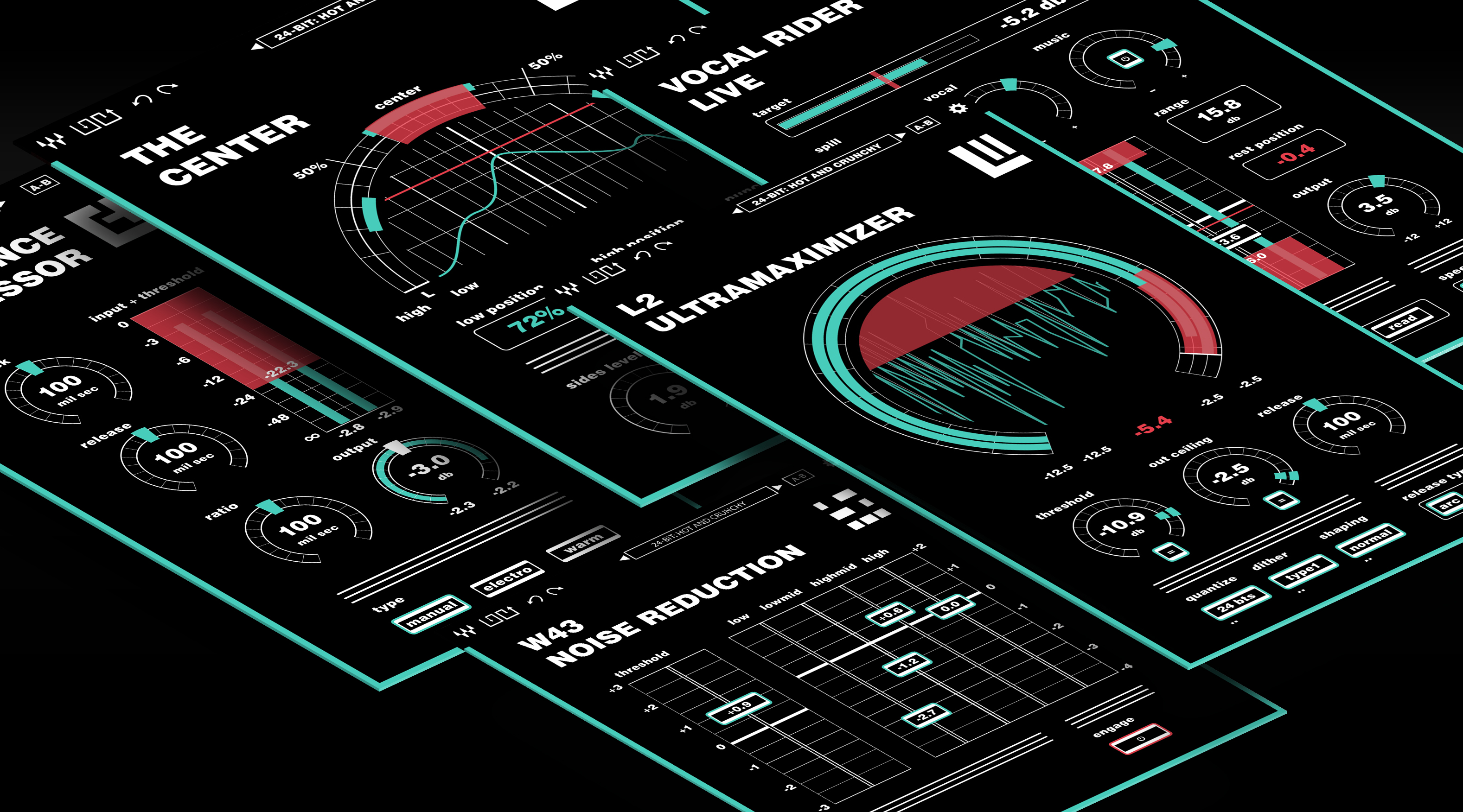
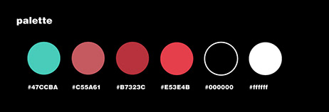
The redesign was built to WCAG AA and AAA contrast standards throughout. Every text element, label, and parameter value achieves a minimum contrast ratio of 4.5:1 against its background. Critical readouts target 7:1 for AAA compliance. The palette is a tight set of four colours: a teal active state, two shades of red for signal and warning states, and black — all grounded in audio industry conventions for metering and signal flow.
Typeface: Helvetica Heavy in lowercase wherever possible, chosen for outstanding legibility at small display sizes — the 9–11pt labels that appear on plugin parameters where space is limited and precision matters.
Touch targets: Every interactive element was sized and spaced to function in a touch input environment, both as future-proofing and because larger targets reduce mis-clicks during a session and lower the physical precision required in creative flow.
Paired text inputs: Every slider has a companion numeric text field. Users can drag to approximate a value, then type the exact number — or calculate it from session data directly.
The Component System
The components took three full iterations to arrive at. The first attempts tried to preserve too much of the original Waves visual language. The second round overcorrected into sterility. The breakthrough came from stripping every element back to its most basic functional form, then building back up only what earned its place.
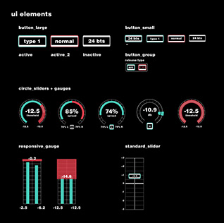
Knobs follow a shared arc convention with the current value printed inside the arc face. In some configurations the knob allows the user to directly manipulate the signal shape rather than just setting a numeric value.
Sliders appear in vertical orientation for level controls — the convention inherited from mixing boards — and horizontal for frequency ranges. The numeric value is printed on the slider face itself, eliminating the need to hover or focus to read the current state.
Buttons represent binary states. Dropdowns are indicated by a double-dot beneath the label. When buttons are grouped in a circle, they represent related plugin-specific commands. Inactive plugins render without a coloured border; the border activates with colour only when engaged.
Grid: All elements are placed on a consistent underlying grid shared across the suite. The proportions are grounded in phi and the Fibonacci sequence — knob track spacing is 1 pica, interior padding is 1 pica, interior elements are 2 picas tall — creating visual harmony that scales across all five plugins without feeling imposed.
Plugin Redesigns
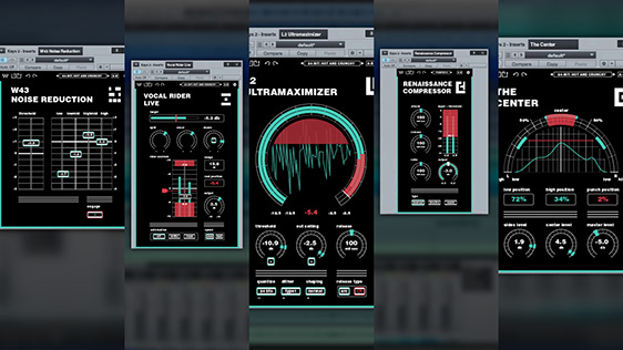
The system was applied across five plugins chosen to represent a cross-section of common component types and interaction patterns.
L2 Ultramaximizer
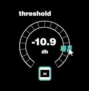
The L2's original design used vertical sliders on a warm sand background — functional but visually indifferent to what the plugin actually does. The rework transforms the dominant visual into a large circular arc meter that simultaneously displays three modes of information: a metering ring around the perimeter, a live waveform inside, and knob/dial controls for threshold, out ceiling, and release below.
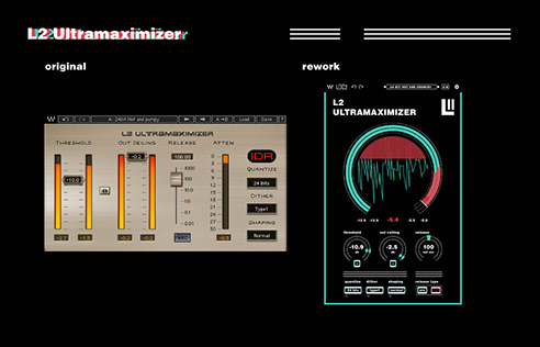
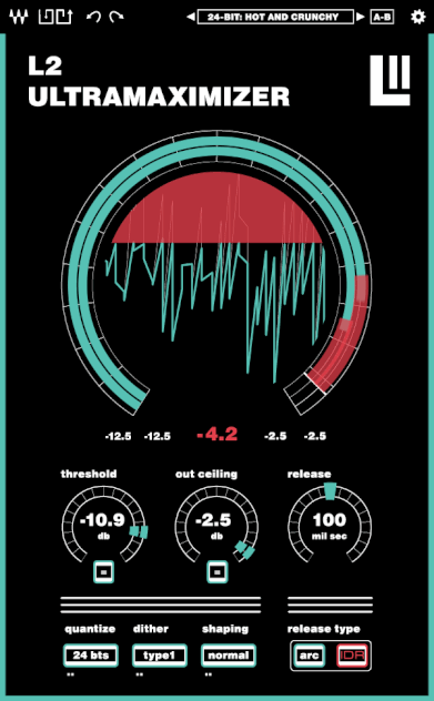
The large metering ring turns the L2's central function — showing how hard the limiter is working — into the most prominent visual element. The original made you read three separate sliders and mentally synthesize the state. The rework shows it directly.
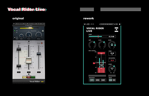
Vocal Rider Live
The Vocal Rider's original interface was a case study in form obscuring function. Watching a tutorial revealed that the layout communicated almost nothing about how to use it.
The rework keeps the same controls but reorganises them in reading order: target level at top, sensitivity knobs below, rider controls and metering in the center, automation and speed at the bottom. The workflow becomes legible from first glance.
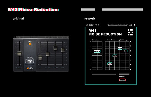
W43 Noise Reduction
The W43's original design used unlabeled dark sliders that gave no feedback about current values. The rework adds labeled slider faces that print values directly and pairs each control with a text input — particularly important when setting frequency-specific noise thresholds from a reference measurement.
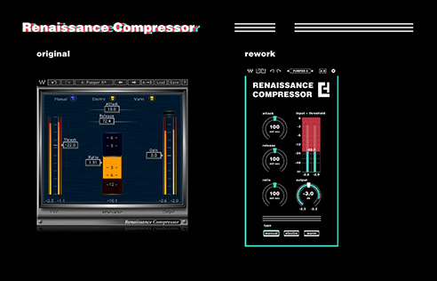
Renaissance Compressor
The Renaissance Compressor redesign prioritises space efficiency. The original spread its controls across a wide horizontal canvas. The rework is compact and vertically structured: attack and threshold at top, release and input/threshold meter in the center, ratio, output, and type below. The output knob shows the adjusted gain reduction level, giving engineers a live read without a separate metering panel.
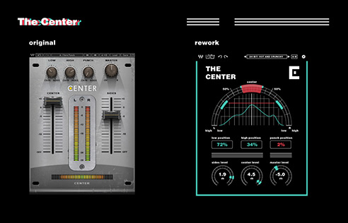
The Center
The Center plugin offered the most interesting design problem in the suite. Used to enhance or suppress stereo sounds, the original's dated interface made it hard to target specific elements in the stereo field. Small knobs with no spatial metaphor offered no intuitive sense of position.
The rework blows up the center panning arc to dominate the interface and places controls along its curve. The arc represents the stereo field directly — controls sit at the points in that field where they act.
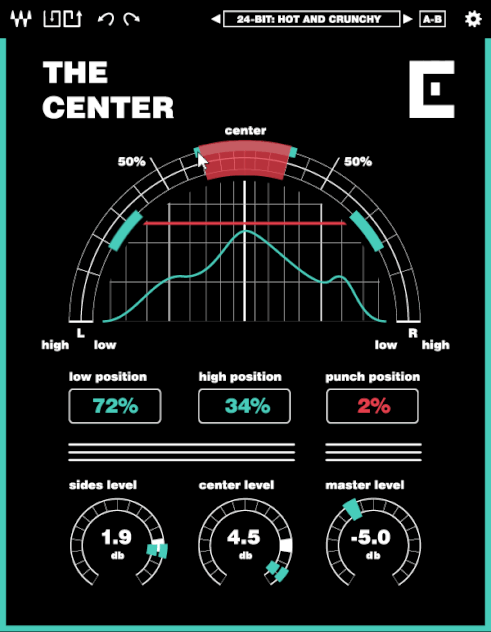
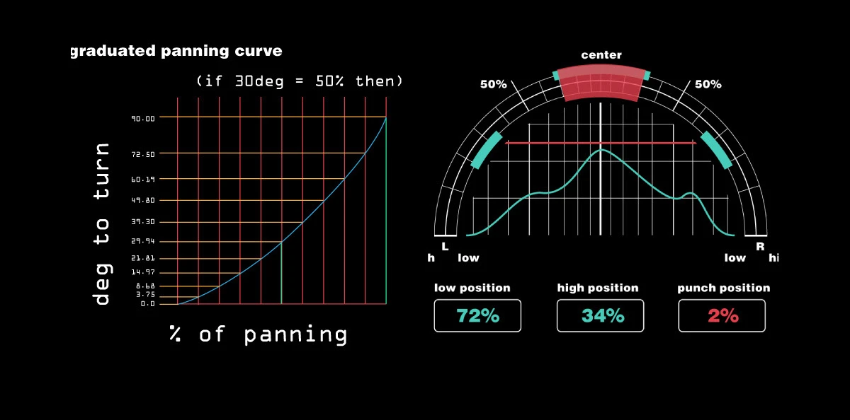
Perceptual Panning: The Center's Custom Curve
The Center required a deeper technical decision about how panning is represented at all.
When audio is panned in a stereo field, perceived position does not follow a linear curve. Due to HRTF (head-related transfer function), 30° of physical speaker separation is perceived as roughly 50% toward a side — not the linear 33%. Standard linear panning controls misrepresent this, leading engineers to over-pan to achieve the placement they want.
The Center's panning control applies a quadratic ease to the displayed arc, mapping visual position to perceived position rather than raw signal value:
y = 0.006x² + 0.3x
Where y is the adjusted angle and x is the desired perceived percentage toward a side from center. This gives the user direct control over where a sound will appear to sit in the listener's stereo field — accurate to the placement of the markers in the UI.
Outcome
The thesis produced a complete redesign of the Waves plugin suite's visual language: a documented component system, accessibility compliance at AA and AAA levels across all five plugins, and a coherent design rationale grounded in the mathematics and conventions of audio engineering.
The project demonstrated that accessibility and aesthetic coherence are not in tension in audio software design. Constraints like minimum contrast ratios, touch-friendly target sizes, and paired text inputs produced a more usable interface for all users — not just those with accessibility needs. The limitation forced clarity.